NerdWallet
Secured Loans Redesign
Overview
SUMMARY
Redesigned a high-intent secured loans landing page and lead capture flow to reduce form abandonment, improve lead quality, and support revenue growth.
MY ROLE
Product designer
TEAM
Cross-functional team of 6
Outcomes
21%
YoY conversion (July 2025)
41%
YoY conversion (August 2025)
Context & constraints
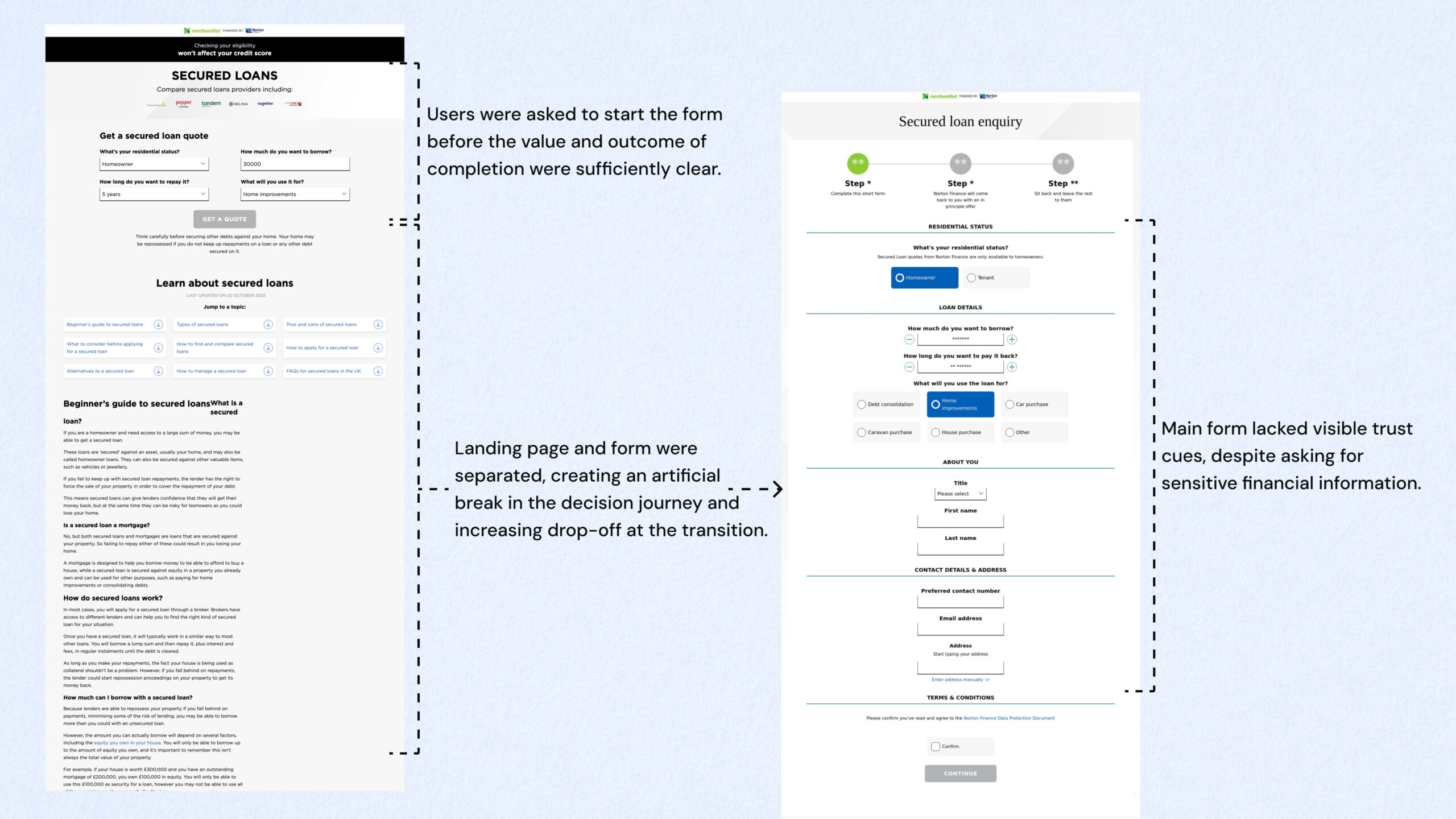
The page captured leads from users actively researching secured loans, and the work focused on improving an underperforming, high-drop-off acquisition funnel.
The funnel was underperforming due to:
- High drop-off before form completion
- Users being unclear about what happens after submission
- Low trust in the lender and process
Key constraints
- No immediate A/B testing capability
- Revenue impact made this a high-risk surface
- Pressure to increase conversion without flooding partners with low-quality leads
The problem
The business faced low conversion and high form abandonment, which directly impacted revenue and lead quality.
Users were dropping off before completing the form because they didn’t yet:
- Understand the value of completing it
- Have confidence in the lender
- Have assurance about what happens after submitting sensitive details
Business risk
If left unchanged, the business would continue spending on traffic that converted poorly, producing fewer and lower-quality leads while increasing downstream inefficiencies for our partner.
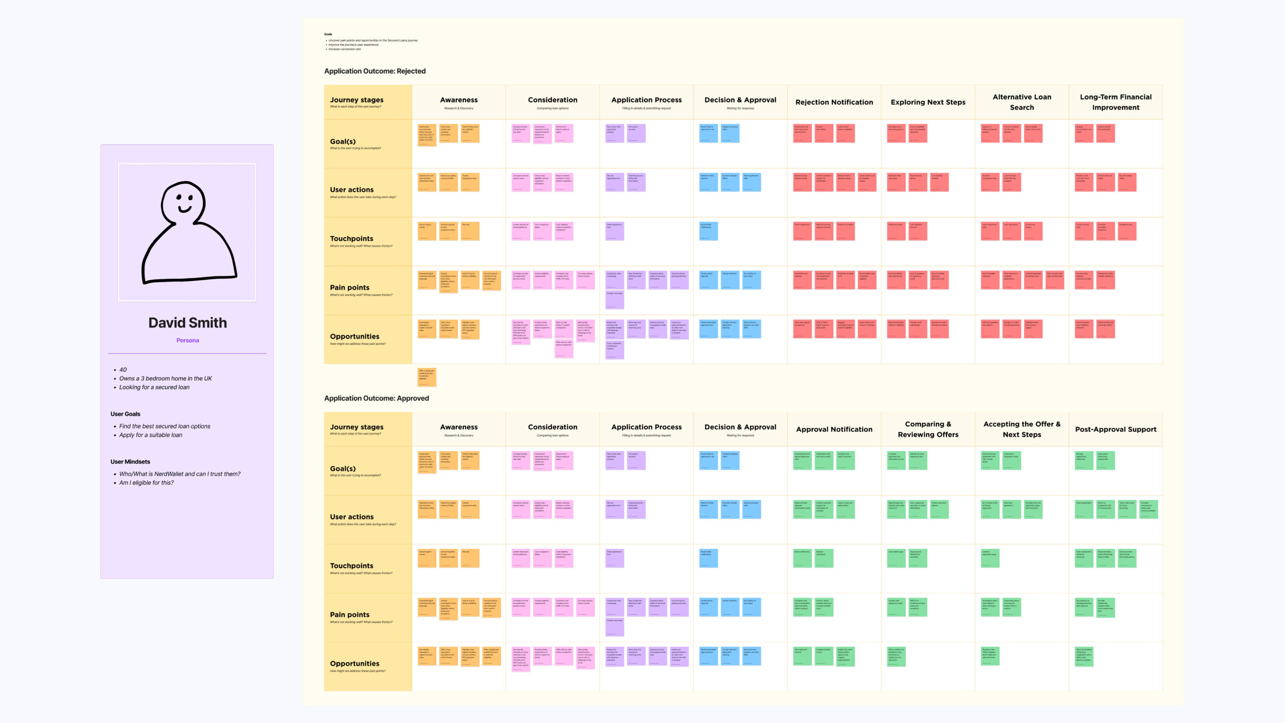
Research: customer journey mapping
To diagnose the problem, I mapped the end-to-end journey by reviewing drop-off points in funnel analytics, session replays and on-page feedback.
The journey map helped me identify:
- Where users hesitated (and what question they were trying to answer)
- What questions were unresolved at each step
- The highest-risk moments for trust breakdown and abandonment
Approach
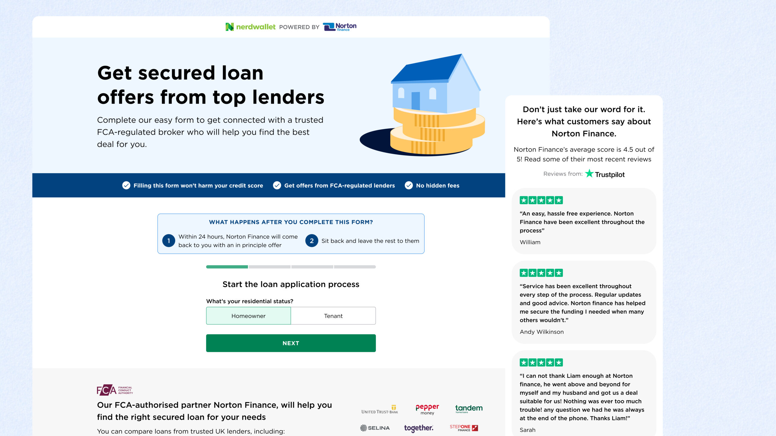
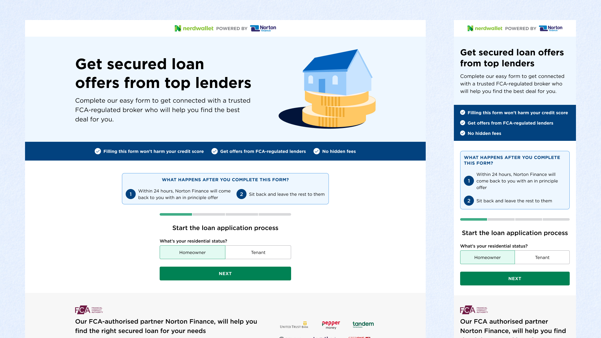
Unified the experience into a single flow
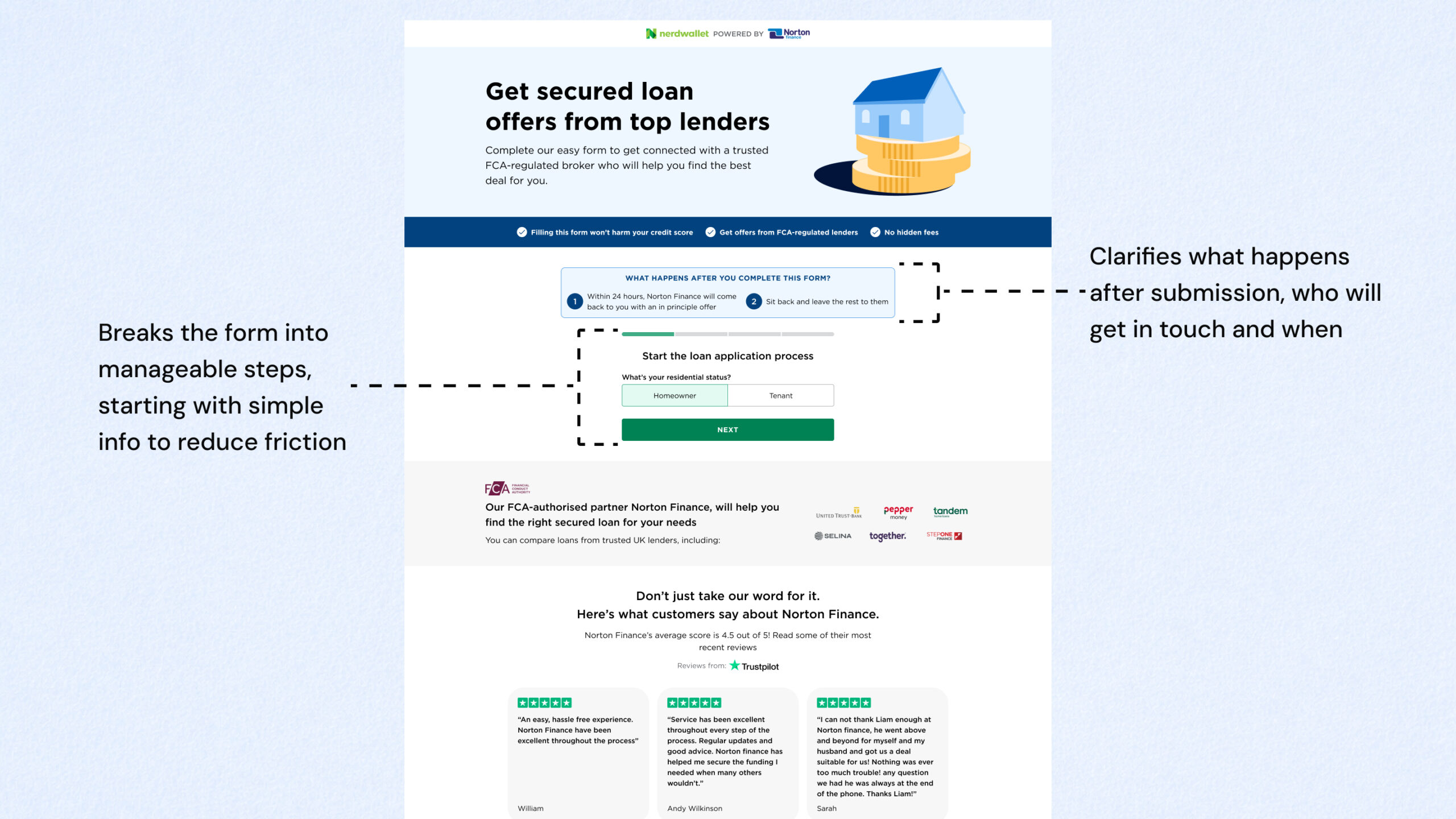
I collapsed the landing page and form into one cohesive journey to reduce context switching and drop-off between steps.
Why: Users were reassessing trust and effort every time the page changed.
Used progressive disclosure to reduce perceived effort
I restructured the form so users encountered questions gradually, aligned with their mental model and readiness to commit.
Why: Reducing perceived workload increased completion without compromising lead quality.
Made the post-submission outcome explicit
I added clear explanations of:
- What happens after submission
- Who the user hears from (and when)
- Why the information is required
Why: Uncertainty about next steps was a major driver of abandonment in a financial context.
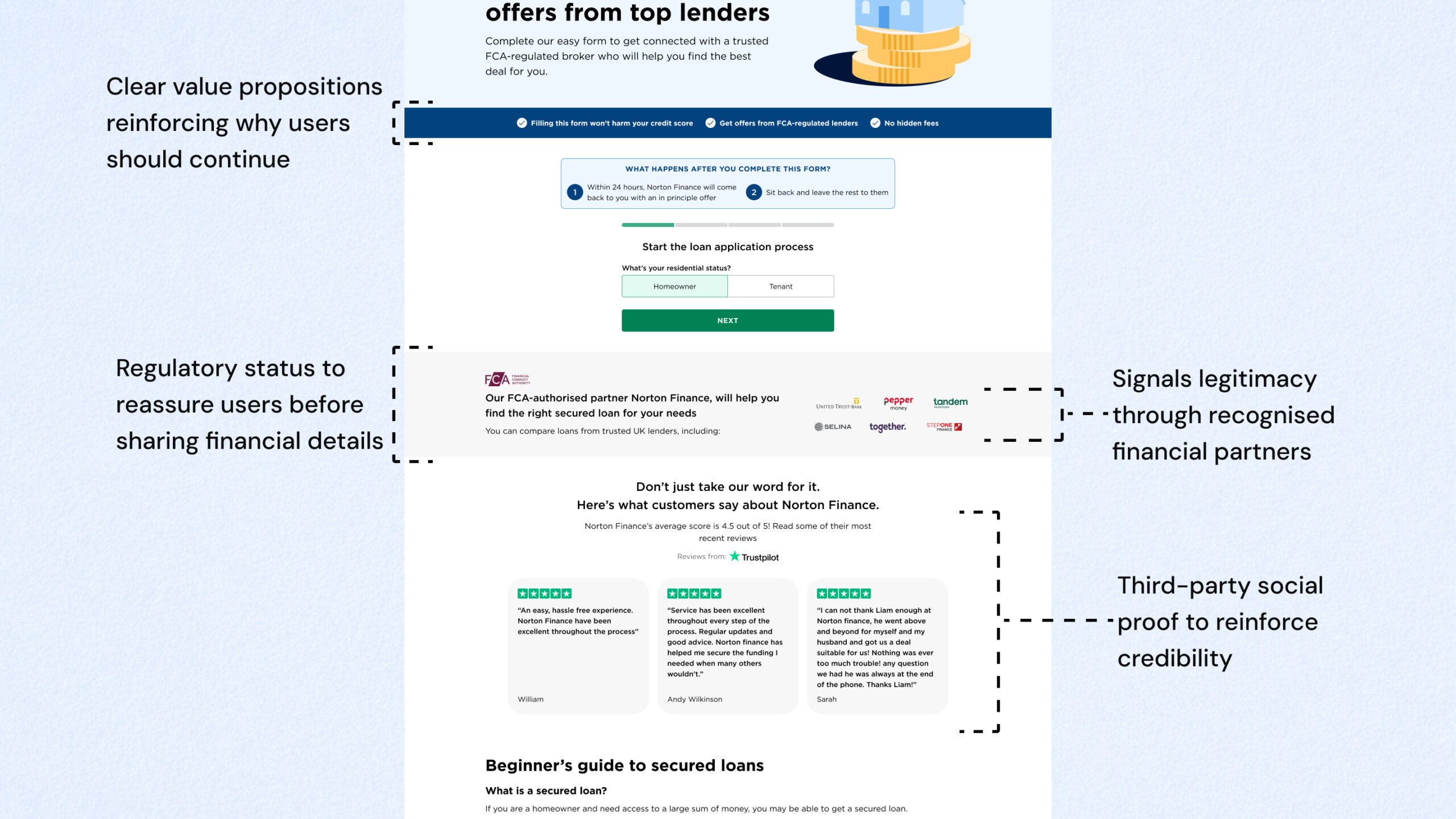
Placed trust signals at hesitation points
I introduced Trustpilot reviews of the partner, FCA status, provider logos, and clear USPs. I placed these where the journey map showed users were most likely to question legitimacy.
Why: Trust signals deliver value when they align with moments of uncertainty in the decision flow.
Owned launch measurement despite limited tooling
Because A/B testing wasn’t feasible, I aligned with stakeholders upfront on:
- Success metrics and tracking plan (pre/post)
- Comparison windows and seasonality caveats
Why: Even without perfect experimentation, we needed a shared definition of success.
Impact
- +21% YoY conversion uplift (July 2025)
- +41% YoY conversion uplift (August 2025)
Beyond the uplift
The redesign reduced uncertainty at the point of submission, giving the business confidence to increase traffic spend without degrading intent.